


In about 1998 a decision was made by the leaders of The Church of Jesus Christ of Latter-day Saints to build a website dedicated to family history. Here is a short explanation of the process from Wikipedia: FamilySearch:
In May 1999, the website first opened to the public as FamilySearch. The beta version, released April 1, almost immediately went off-line, overloaded because of high popularity. Only a few days after the official launch, the website had received an estimated 100 million hits. To handle the load, site visitors were only given access to the site for 15 minutes at a time. In November 1999, 240 million names were added, bringing the total number of entries to 640 million.
Of course, today FamilySearch.org has billions of records and a huge, very popular website. One of the challenges of the website is that it is constantly changing. FamilySearch continues to add and subtract features on a regular basis. I decided to take a close look at every part of the website that I could discover over the next blog posts. Of course, I will give my comments about the functionality, need, usefulness, ease-of-use, and ultimate value to genealogists about each section/feature/web page/whatever of the website. So here it goes.
I guess the place to start is the home page or start up page. You can see mine at the beginning of this post above. Now, what can I say? This seems to be the standard page for anyone who has not yet signed in to the website. It does not convey any useful information at all. It may be the vogue to have minimalist web pages but this one does not even identify FamilySearch as an entity except for the logo. I am not aware if anyone see anything different. That may happen in countries that do not speak English. The mobile app version of the start up page is exactly the same (for me). What is the secret? You can scroll down to see more information.
FamilySearch.org
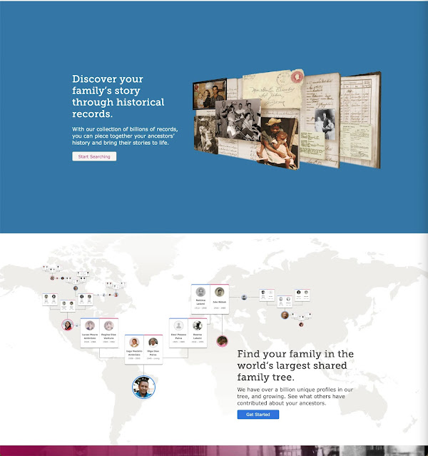
Although I am not sure how I am supposed to know that this screen is really the first in a long number of screens that have more information. Many websites now use this scroll-down type of start-up page but usually, it is obvious from what you see that there is more information available by scrolling down. Here is a screenshot of Adobe.com. You can see that there are images at the bottom of the start up page that extend off of the page. This is a visual cue inviting you to scroll down for more information.

Is it my screen size or whatever that keeps me from seeing that the startup page on the FamilySearch website is scrollable? I can see a bit of the next screen on my iPhone so maybe others see some visual cue as to the scrollable portion?
Now what?
I log in. Anyone using the website will soon learn that most of the features of the website are available only if you register for a free account. That is hard for me to show with an image because I am already signed into the website with an option that keeps me signed in for two weeks.
This brings me to one of the most common issues with the website: signing in. I have spent the last few days trying to help one of my associates sign into FamilySearch.org and also ChurchofJesusChrist.org, the website of The Church of Jesus Christ of Latter-day Saints. Since the initiation of the login requirements for both websites, members of the Church have been able to use the same login and password for both programs. That convenience has now ended and I am spending a significant amount of time helping people straighten out their passwords and logins. See the following announcement: "FamilySearch Accounts Now Separate from Church Accounts." See also: "FamilySearch and Church Account Split."
Here is a quote the "FamilySearch and Church Account Split" article.
FamilySearch is growing rapidly. Growth has made it necessary to separate FamilySearch.org and ChurchofJesusChrist.org accounts. As of September 13, 2021, FamilySearch accounts and accounts on ChurchofJesusChrist.org (“Church Accounts”) are no longer linked. The change does not change how most users sign in to FamilySearch.
In the previous system used to manage accounts, any account created on FamilySearch.org created a matching account on ChurchofJesusChrist.org. Similarly, any account created on ChurchofJesusChrist.org created a matching FamilySearch account. The dual linked accounts existed for all users. Now, FamilySearch accounts are created and managed only on FamilySearch.org and Church Accounts are created and managed only on ChurchofJesusChrist.org.
The change does not impact how you use FamilySearch.org. However, separating accounts allows FamilySearch.org to accommodate future growth, simplify access, improve security and privacy, and conserve Church resources.
This has always been a background issue with FamilySearch and almost all other websites. Logins and passwords are a mystery to many neophyte computer users but can be an issue with anyone using a computer. This is true for me because I have hundreds of specific logins and passwords to manage. (Please do not comment about the fact that there are programs available to manage my passwords. I know this. You might also remember that it takes a login and password to use these programs. I resort to a list rather than use another online program.)
Well, I got to the startup page. That was a good start. Only a few hundred or thousand pages to go.
Oh, do I have any suggestions for FamilySearch? Yes, redesign your startup page and show a path to more information like the mobile edition.
I've been using FamilySearch for over a year. I had no idea I could scroll down on their home page!
ReplyDelete