If you would like another opinion of the new programs, take a look at Randy Seaver's post entitled, "First Look at the FamilySearch Family Tree Mobile App."
Here are some screenshots with comments:
This is the sign in screen for the Tree app. You use your FamilySearch account login and password.
The app seems to come up in Photo view. I didn't see any other way to view the Family Tree.
The Settings menu was rather scanty and simple. I assume other preferences will be added in subsequent versions.
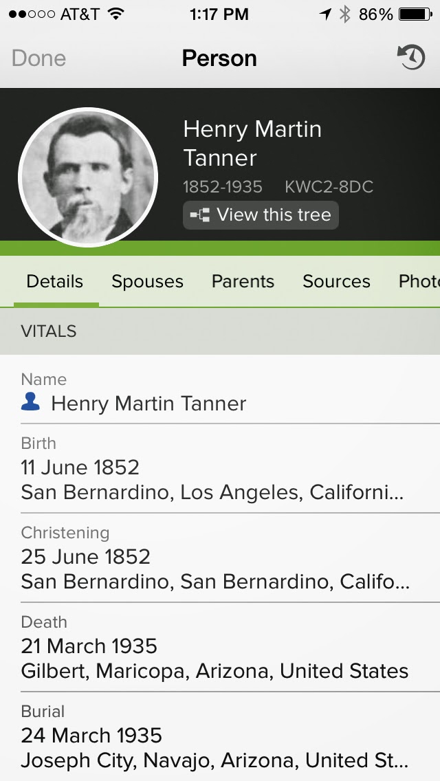
This is an example of a Details Page. It looks like other views are available through menu items. Probably a good choice of features.
You can switch to put the current person in the No. 1 position, but the app is limited to this particular view, as I mentioned above.
It took a couple of minute load all of my photos. You could add a photo and otherwise the app was much more limited than the desktop program.
You can view a single file in the Photos Section, but nothing more.
I expect both programs will change over time. Right now they are interesting and the programs seem to be poised to supply more features.


A post sharing with proper images is better than that post which has only thin text. So thanks for the sharing and just keep the good work.
ReplyDeleteThis comment has been removed by a blog administrator.
ReplyDeleteNice post and your app are very useful for connecting with family members. Presentation is attractive.
ReplyDelete